tag
#ui-ux
year
2015
description
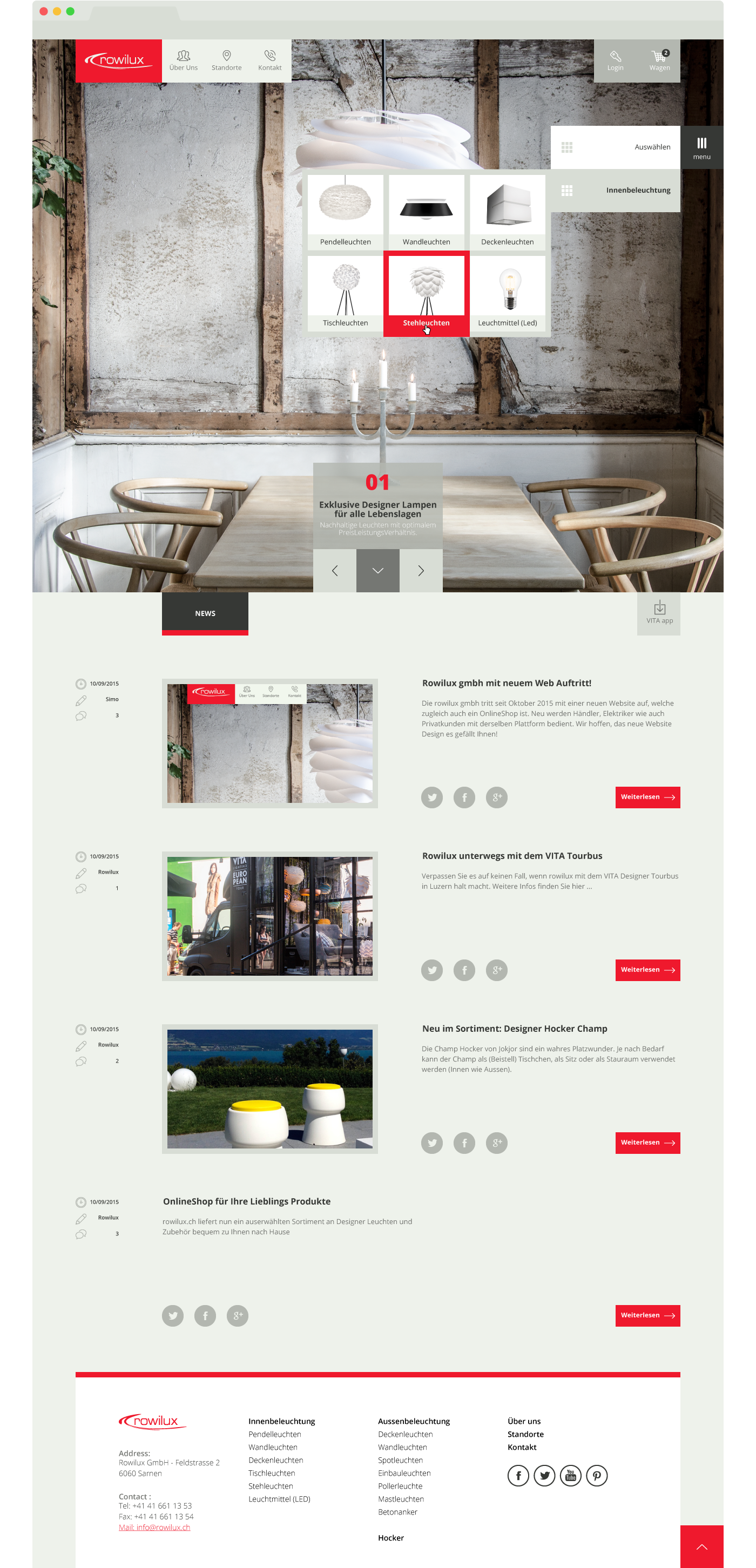
The goal was to make the navigation clear and immediate, without forgetting the importance of the product. In this design I tried to give due importance to the elements by assigning the right proportion.


#ui-ux
2015
The goal was to make the navigation clear and immediate, without forgetting the importance of the product. In this design I tried to give due importance to the elements by assigning the right proportion.

